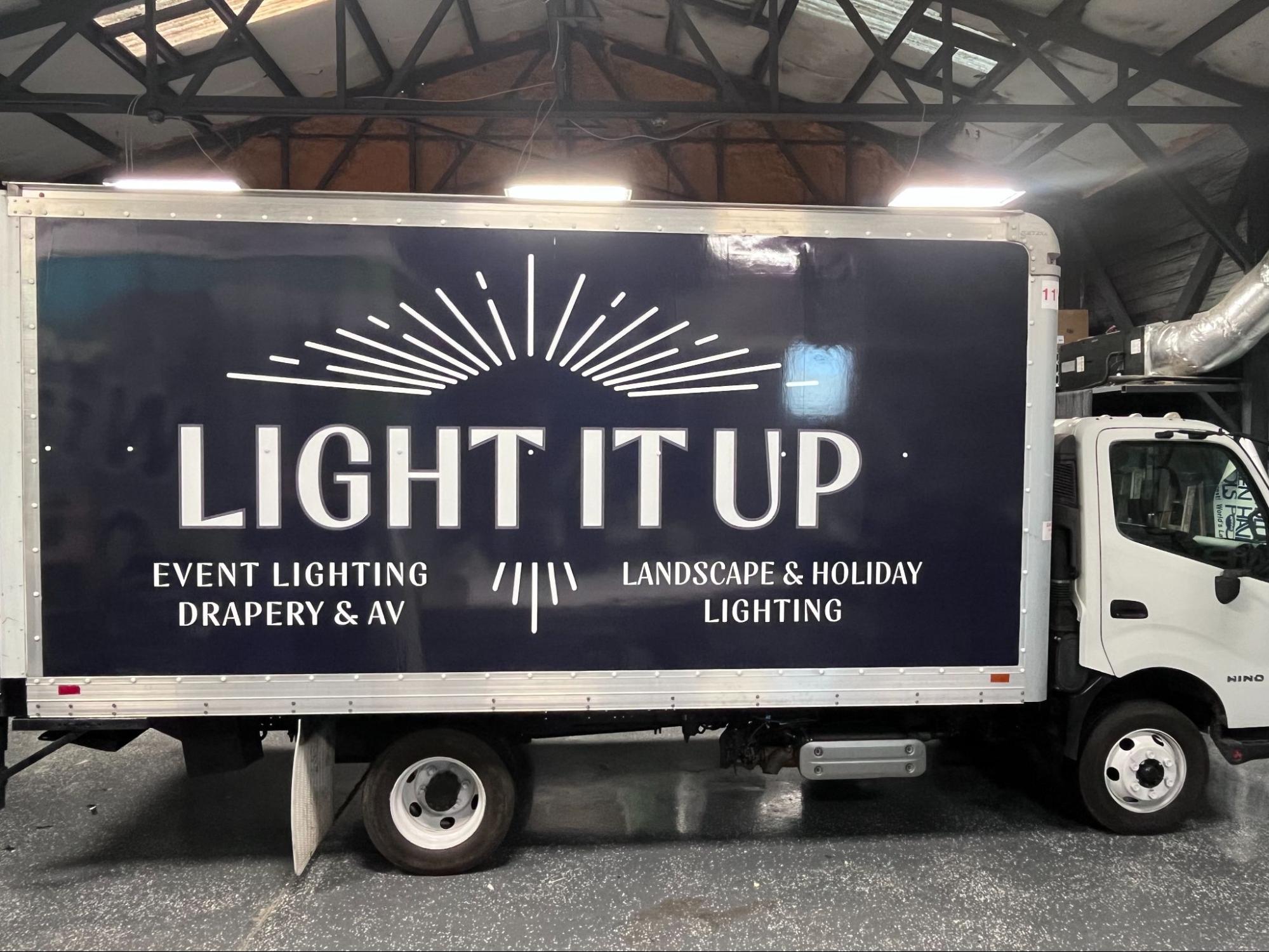
You get about two seconds. That is the window a driver in the next lane on I-26 has to look at the side of your truck, register something, and go back to watching the road.
Two seconds at 55 miles per hour covers roughly 160 feet of pavement. Whatever you put on that box either lands in that window or it does not land at all.
Most box truck graphics fail this test, and they fail for a reason that has nothing to do with print quality. They were designed on a monitor, at arm’s length, where every element looked perfectly readable.
How big does lettering need to be on a box truck?
The working rule for highway legibility is one inch of letter height for every ten feet of viewing distance. A driver two lanes over sits about 25 feet away, so one inch buys you clear reading at that range. At 100 feet you need ten inches.
For a box truck side, that translates into practical minimums:
- Company name: 18 to 30 inches tall
- Phone number: 12 to 18 inches tall
- Primary service line: 8 to 12 inches tall
- Anything smaller than 4 inches: decorative only, nobody reads it moving
A standard 16 foot box truck gives you roughly 15 feet of usable length by 7 feet of height per side. That sounds enormous until you start placing 24 inch letters on it and realize you have room for about three lines of content.
Which is the correct amount of content.
The rear door is a different problem. Rear graphics are read by the driver directly behind you, at a shorter distance, often stopped. That is the one place a website or a QR code makes any sense, because someone at a red light has time.
What actually makes graphics readable at speed?
Contrast does more work than size. A truck with 30 inch letters in medium gray on white is less readable than one with 18 inch letters in black on yellow.
The combinations that survive glare, rain, and low sun angles:
- Black on white or on yellow
- White on dark blue, black, or dark red
- Yellow on black
The ones that fail: red on black, which vibrates and blurs at distance. Any two mid-tone colors together. Thin script fonts of any color. Gradients behind text.
Typeface choice matters as much as color. Heavy sans-serif faces with open counters read cleanly at speed. Condensed fonts let you fit more characters and cost you legibility, which is a bad trade. Outlined or shadowed text muddies the edges that make letters recognizable.
Then there is the layout question people get wrong most often: dead space. Designs that fill every square inch read as visual noise, and the eye finds no entry point. Leaving genuine empty space around your name is what makes the name jump out.
Look at national fleets on the interstate. Almost all of them run one dominant element, one supporting line, and a lot of open background.
Where do you put graphics on a box truck?
Placement follows how people actually see the vehicle, and the sides are not equal.
The passenger side gets seen most in traffic, since drivers pass on the left and view your right side. It is also the side facing the curb during deliveries and the side visible to pedestrians and storefronts. If budget forces a choice, that side wins.
The upper two thirds of the box is the readable zone. The bottom third gets blocked by other vehicles, guardrails, and road spray, and it collects the worst of the grime.
Avoid running critical text across the roll door seams and hinges on the rear. Vinyl over a hinge line flexes every time the door opens and starts failing there first. Keep your phone number off any seam.
The nose of the box, facing forward above the cab, catches attention in stop and go traffic and from anyone in a taller vehicle. It is cheap real estate that usually goes unused.
Is a full wrap worth it on a box truck?
A full wrap on a box truck starts at $5,000 depending on length, and it makes sense when the truck is a rolling storefront rather than a hauling tool.
Full coverage gives you photographic imagery, a colored background that works as brand recognition on its own, and a clean look that hides the seams and door tracks. Food service, retail delivery, and consumer-facing service businesses tend to get their money’s worth.
Partial coverage starts at $2,500 and gets you 80 percent of the visual impact if the design is strong. Cut vinyl lettering on a plain white box starts at $900 and still reads perfectly at highway speed if the sizing is right.
Plain white boxes have an advantage worth mentioning. White reflects heat, which matters for anything temperature sensitive in the back during a Charleston July, and it takes a repair patch far more gracefully than a photographic wrap does.
Damage is the practical argument for keeping designs simple. Box trucks get scraped. A loading dock, a low branch, a mirror in a tight alley. Replacing a section of solid color vinyl is straightforward. Matching a section of photographic wrap so the seam disappears is difficult and sometimes not possible.
Car wraps in Charleston, SC deal with curves and body lines. Box trucks give you flat panels, which makes the print easier and the design constraints tighter. Flat means nothing distracts the eye from bad proportions.
One last thing worth checking before you print. Look at the design as a thumbnail on your phone, at about an inch wide. If you cannot read the company name at that size, nobody will read it at 55.
Ready to put your truck to work? Request a quote from Carolina Wraps and we will build a layout sized for how people actually see it.