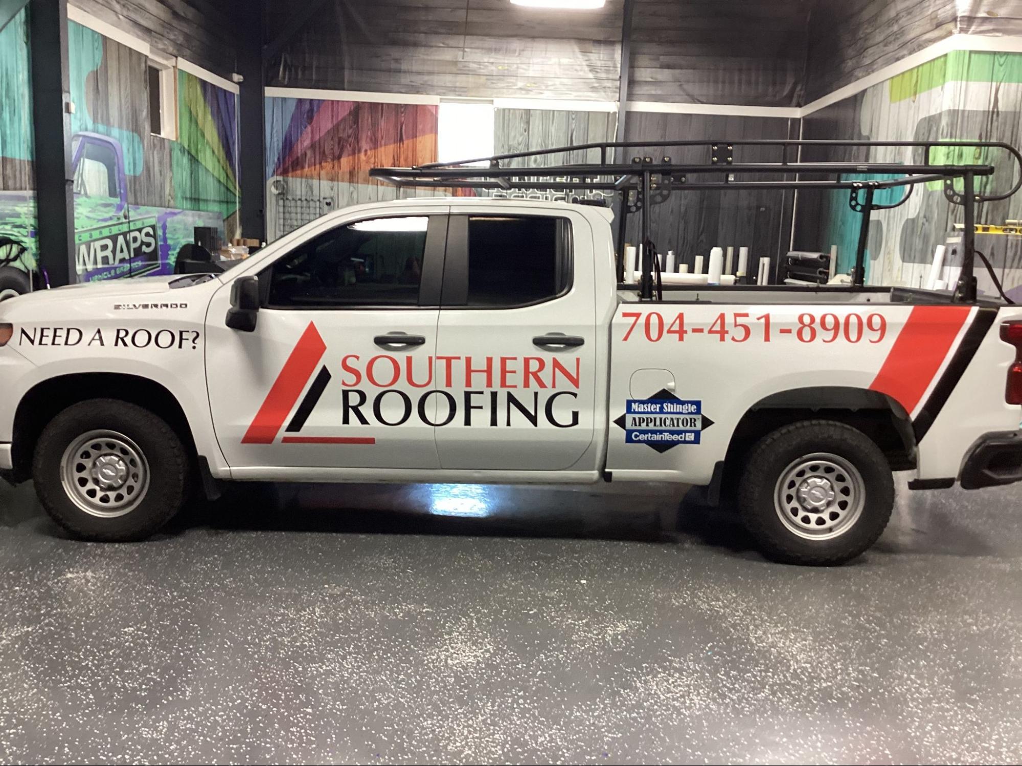
If your work vehicle is blank or hard to read, you’re missing the easiest advertising you already own. Spot graphics and professional lettering can turn everyday driving, parking, and jobsite visits into steady brand impressions that lead to calls.
The risk isn’t that your vehicle “doesn’t look cool.” It’s that people notice you, can’t quickly tell what you do, and move on.
The best-performing vehicle graphics don’t try to say everything. They aim for a fast read, a professional feel, and a clear next step. That reduces missed opportunities, avoids costly redesigns, and makes it easier to scale branding as you add more vehicles.
What are spot graphics on a vehicle?
Spot graphics are targeted vinyl elements placed in high-visibility areas instead of covering the entire vehicle. Think logos on doors, a bold service line on the side panel, a clean call-to-action on the rear, or simple accent shapes that make the layout look intentional.
They’re a smart middle ground if you want results without committing to a full wrap. You get clarity, brand presence, and durability, while controlling cost and keeping downtime manageable.
How to design vehicle lettering that gets calls
Great lettering answers three questions in a few seconds: what you do, where you serve, and how to reach you.
Keep the message tight:
- Business name or logo: recognizable and not buried in clutter
- Primary service line: one clear category, not a long menu
- Contact method: phone number or short web address that’s easy to remember
- Optional trust cue: licensed/insured, family-owned, or another true differentiator
If someone can’t read it at a stoplight, the design is working against you.
Creative spot graphic ideas that look “designed,” not stickered
The goal is to use space strategically so the vehicle looks professional and consistent, even if you’re only using a few elements.
Door logo + service line lockup
Place the logo on the door with a short service line directly below or beside it. This is usually the first area people look at in parking lots and driveways.
Side panel “banner” strip
Add a clean horizontal strip along the side panel and place your service line and contact info on top of it. This boosts contrast and makes lettering readable on white, silver, or busy vehicle colors.
Rear call-to-action layout
The back of your vehicle gets long viewing time in traffic. Use it for the one action you want: call, text, or visit. Pair that with a short service line so people know why they should contact you.
Simple icon system for 1–3 services
Icons can work if they’re restrained. Use a consistent style, keep the count low, and group them together. The point is quick understanding, not a catalog.
Subtle accents that create a “wrap feel”
A small angled shape on the rear quarter panel or a color block behind the logo can make spot graphics feel like a complete design system, without the cost of full coverage.
Where should graphics go if you’re not doing a full wrap?
High-impact placement beats more coverage. Prioritize:
- Doors: primary branding zone
- Rear quarter panels or side panels: space for a readable service line
- Tailgate/rear doors: best area for a call-to-action
- Back window area: useful for simple text or a web address, as long as it stays readable
Avoid placing critical text across seams, handles, or areas where distortion makes letters hard to read.
“Vehicle lettering vs partial wrap” for a small business: how to choose
The best choice depends on your goal and how your vehicle is used.
- Choose lettering + spot graphics if you want a clean, fast read and a scalable system for multiple vehicles. This is ideal for service businesses that need leads and trust more than visual complexity.
- Choose a partial wrap if you need stronger brand presence from farther away, or you’re competing in a dense retail area where bolder visuals help you stand out.
Most owners aren’t choosing between “cheap” and “premium.” They’re choosing between clarity now versus complexity that may not convert.
What “near me” searches really mean for vehicle graphics
Many owners type “vehicle lettering and graphics near me” because they don’t just need printing. They need help making smart decisions about design, material, and placement, plus professional installation that holds up.
That’s where a shop like Carolina Wraps changes the outcome. We handle design support, printing, and installation in a controlled indoor facility, which helps with consistency and finish quality. We also work across different vehicle types, which matters if you’re branding more than a single car.
Questions to ask before you approve your design proof
A few practical questions can prevent rework and disappointment:
- Can you show a proof that simulates readability from a distance?
- What’s the plan for contrast on my vehicle color?
- What will be readable in 3 seconds, and what should be removed?
- Where will seams, handles, and curves affect the layout?
- If I add vehicles later, can this become a repeatable fleet template?
Clear answers here usually lead to better performance and fewer “we should redo this” moments later.
Conclusion: build a simple system that scales with your business
Spot graphics and lettering work when they’re treated like a conversion tool, not decoration. A fast-read layout, smart placement, and durable installation can turn daily driving into consistent lead generation, without the cost and downtime of full coverage.
If you’re ready to stop guessing and get a plan that fits your vehicle and budget, reach out to Carolina Wraps today.